MatchaBar Packaging
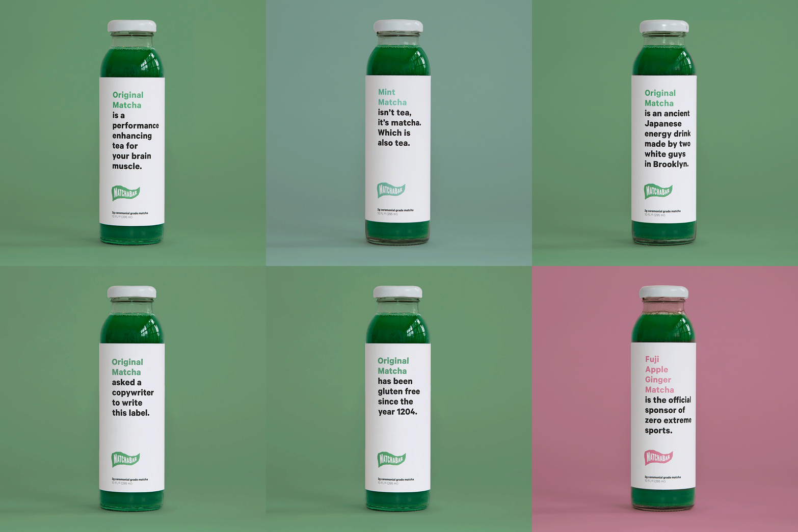
The intent for the redesign was to take on Big Energy and the brand needed to differentiate itself immediately from just another energy drink, not with a little story on the side of the bottle. And if we wanted to stand out on that crazyass Whole Foods shelf, “nice” packaging wasn’t enough.
The brand needed a point of view, so why not give it a voice?
RESULTS: Within months of the redesign being unveiled a deal with Whole Foods to distribute nationally was reached and by the end of the same year the product was featured as a 2018 trend.


Shake the shit out of it.

Iconography by Bobby McKenna.

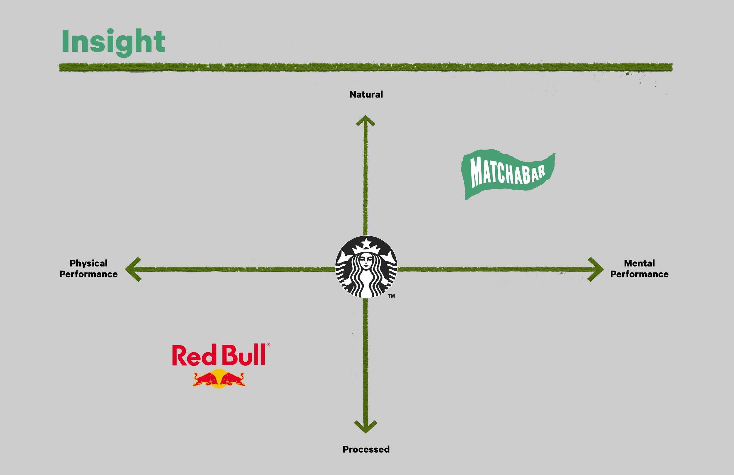
The major insight was that in the energy category these days it's not just about fuel, it's about focus. Calm, focused energy that is driven by matcha's natural caffeine and the not-so-secret ingredient L-Theanine that provides the landing gear instead of the crash of coffee.

Original Packaging

Concept Sketch

